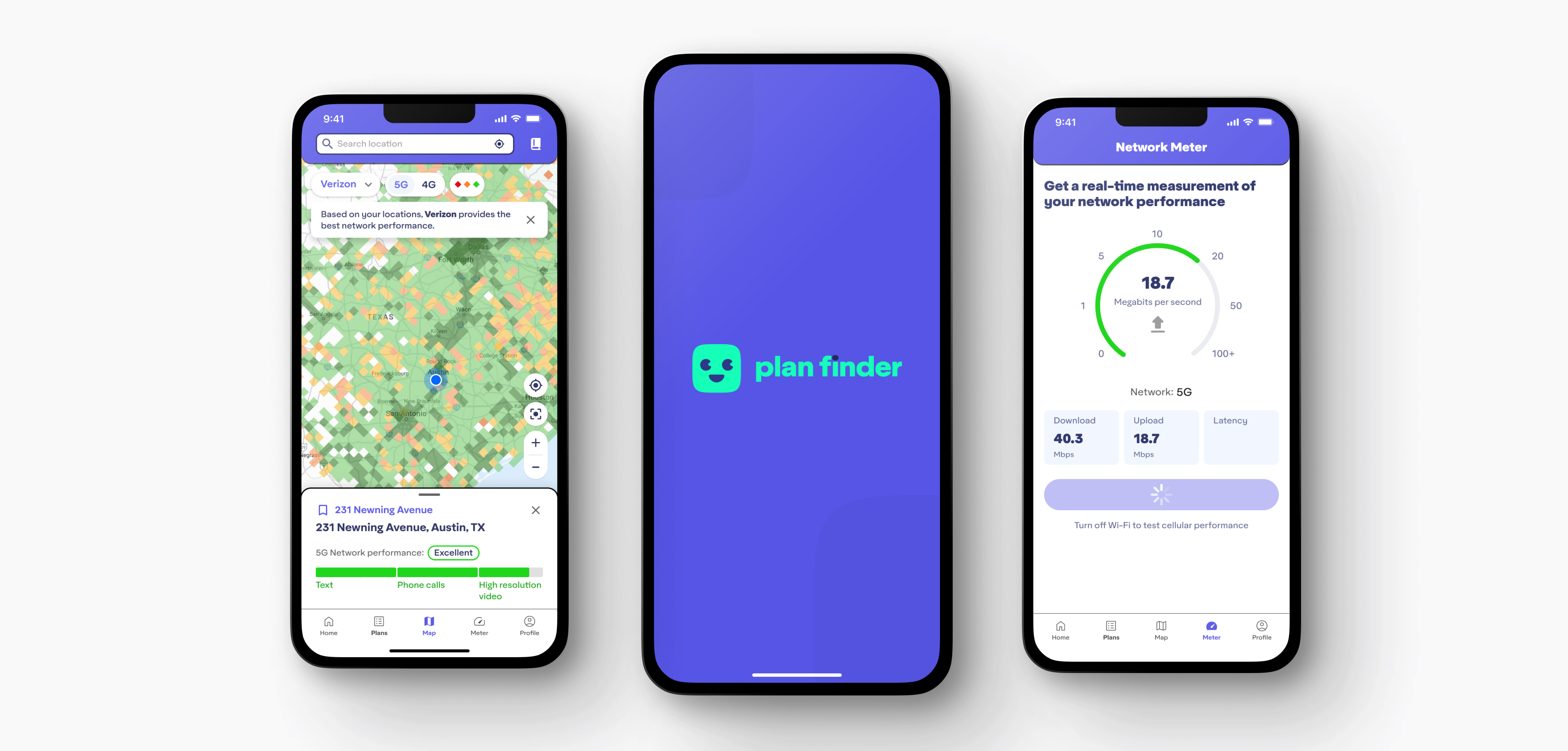
Mobile Plan Finder is a native mobile app that helps smartphone owners of all technical levels find the best phone plan for their needs in the United States.
CONTRIBUTION
User Experience
UI Design
Art Direction
Copywriting
User Story Definition
YEAR
2023–2024

About the project
Disclaimer
Because of non-disclosure agreements, I cannot go into full detail of everything delivered and developed for this project online. I would be happy to chat more in person if you contact me.
The Mobile Plan Finder was designed and developed for a telecommunications company looking to find a solution that would redefine the way smartphone users shop for mobile phone plans. The vision was to simplify the process by providing a user-friendly platform that would give clarity into current plan performance, as well as recommend plans based on what users actually want and need.
When I joined the team, the Mobile Plan Finder only existed as clickable prototypes in Figma and a local demo environment to test the usage of data across a handful of features. The aim was to bring designs to a point where they were ready for developer handoff in order to do a soft launch to both the Apple and Google Play stores.
In order to bring designs to a point ready for implementation, my responsibilites focused on completing the following challenges:
01 | Conduct usability and usefulness testing with users
Designs were at a point where it was time to gather feedback with users to gauge the usability and usefulness of current designs and featuers before launching to any stores.
02 | Update information architecture & features based on feedback
Testing participants revealed that many design updates were needed in order to bring the product to a point where it was ready to be launched to the stores.
03 | Modify screens for a desktop version of the app
Aside from launching on the Apple and Google Play stores, it was decided that we would also launch a desktop version of the Mobile Plan Finder.
01 | Conducting testing with users
The current designs and demo environment were at a good enough place that it was time to bring prospective users in for feedback. It was especially important to gauge the usability and usefulness of proposed features before further development occurred.
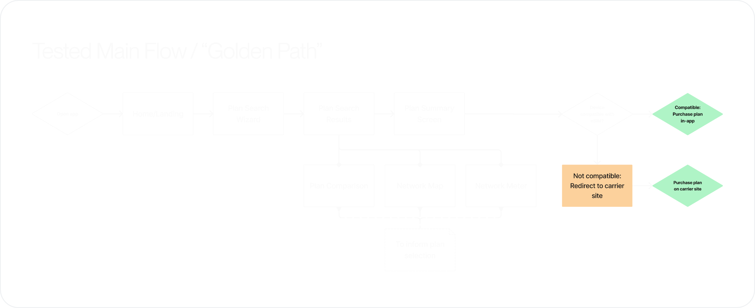
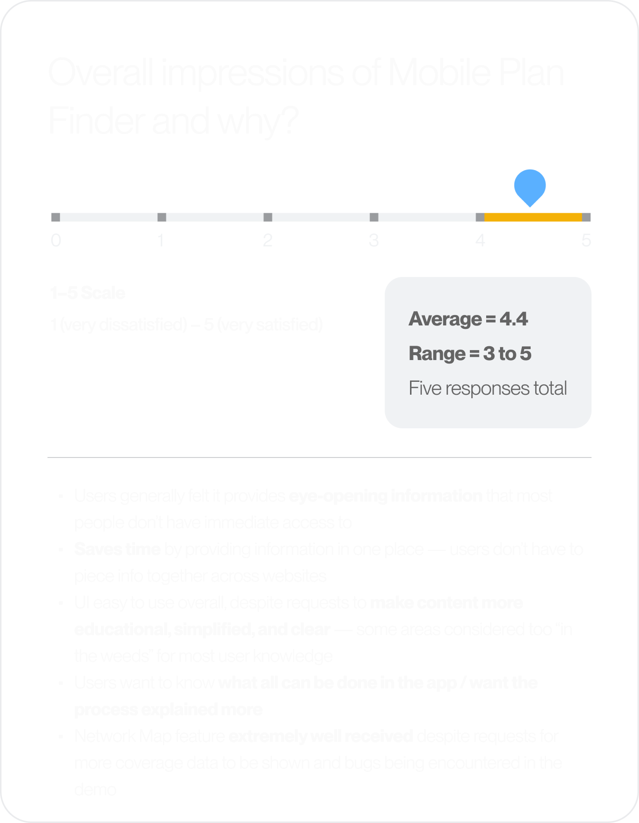
I prepared and conducted five feedback interviews over Zoom with participants from varying organizations across the United States. We tested the product using both the live demo environment and clickable Figma prototypes, and guided users through the main flow or "golden path."

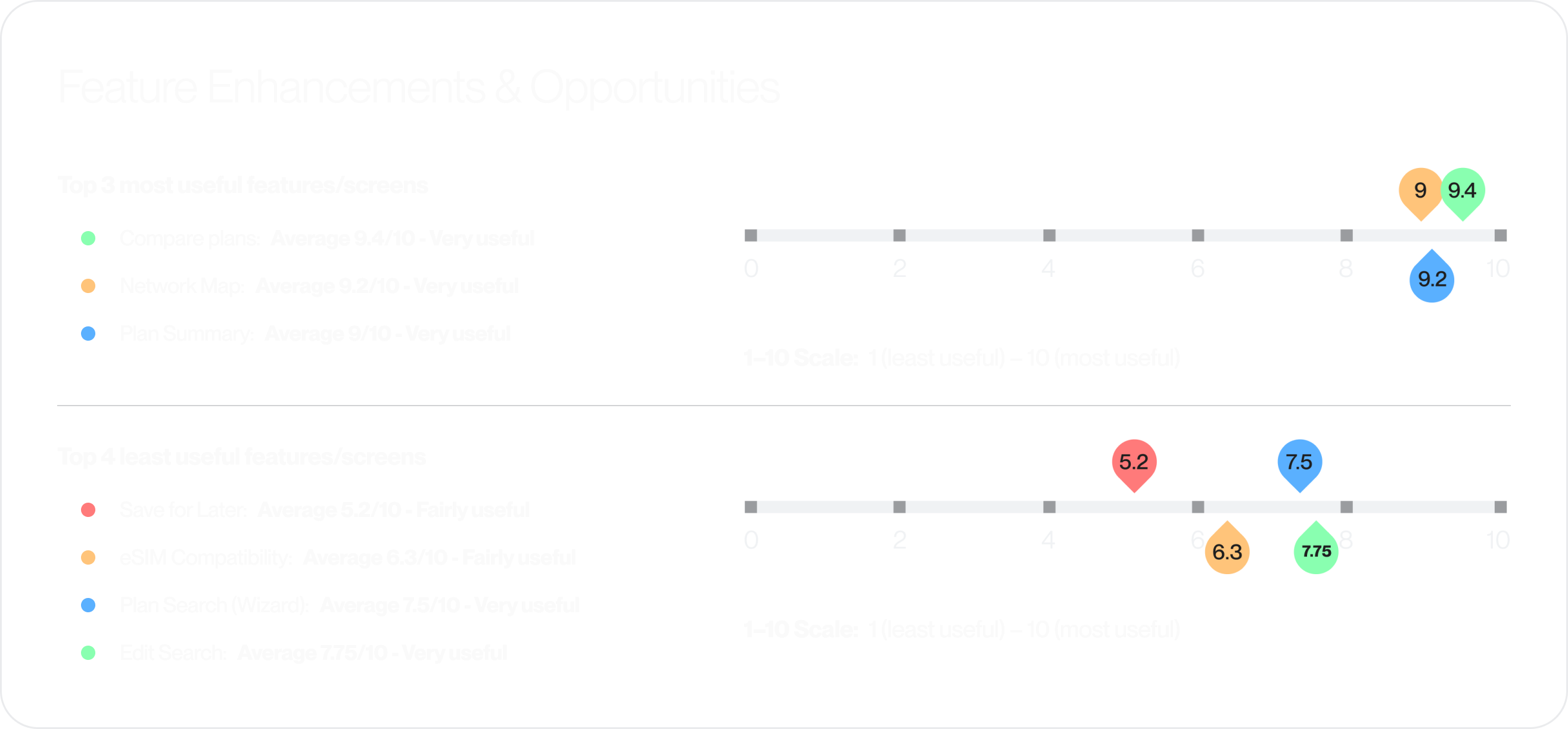
02 | Updating architecture & features
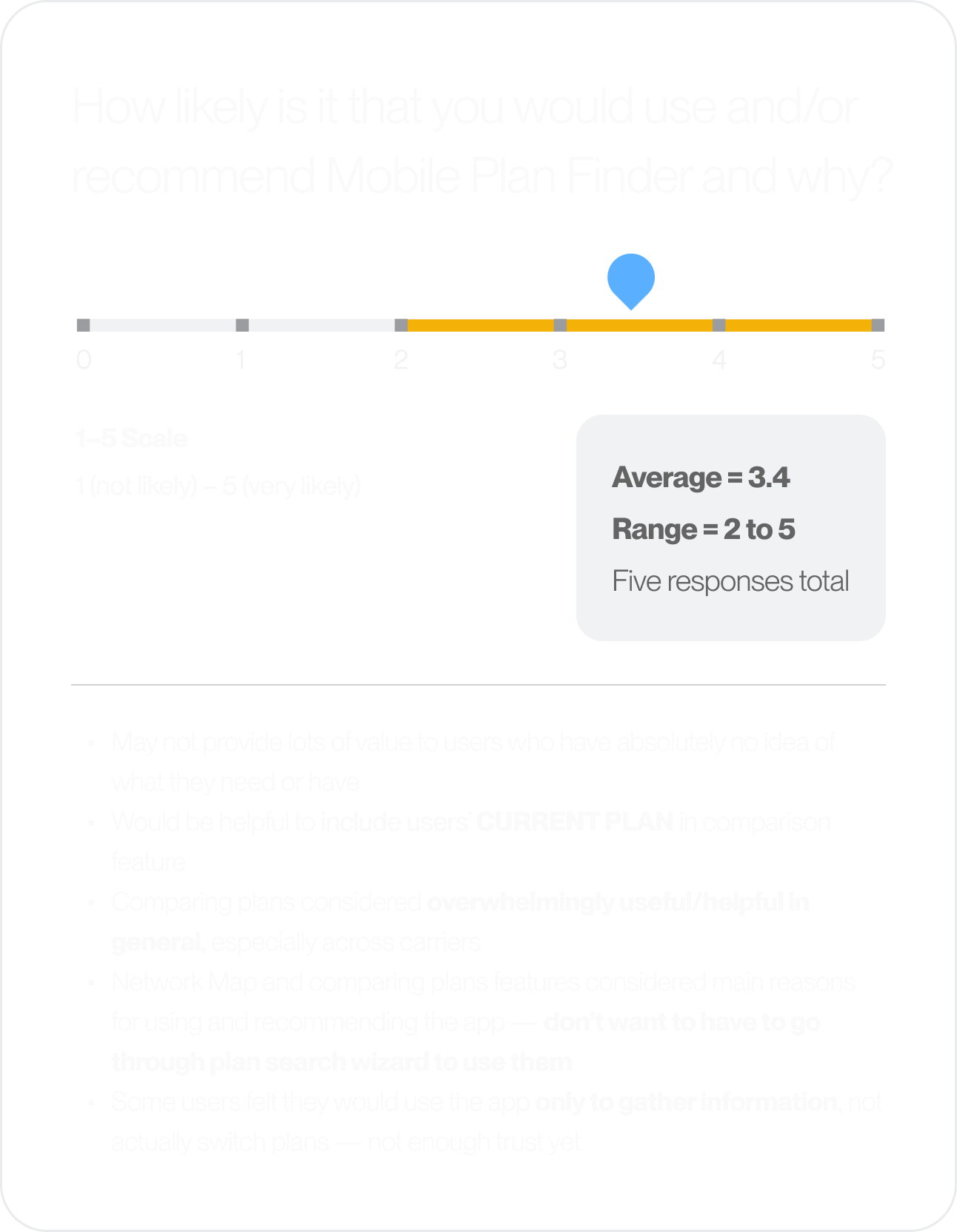
After reviewing the collected feedback and data, it was clear that there were quite a lot of opportunities for improvement, starting with the information architecture. Testing participants made it clear that the Network Map and Meter were considered some of the most important features of the app, and that they wanted to be able to use them before having to work through the Plan Search Wizard (questionairre).
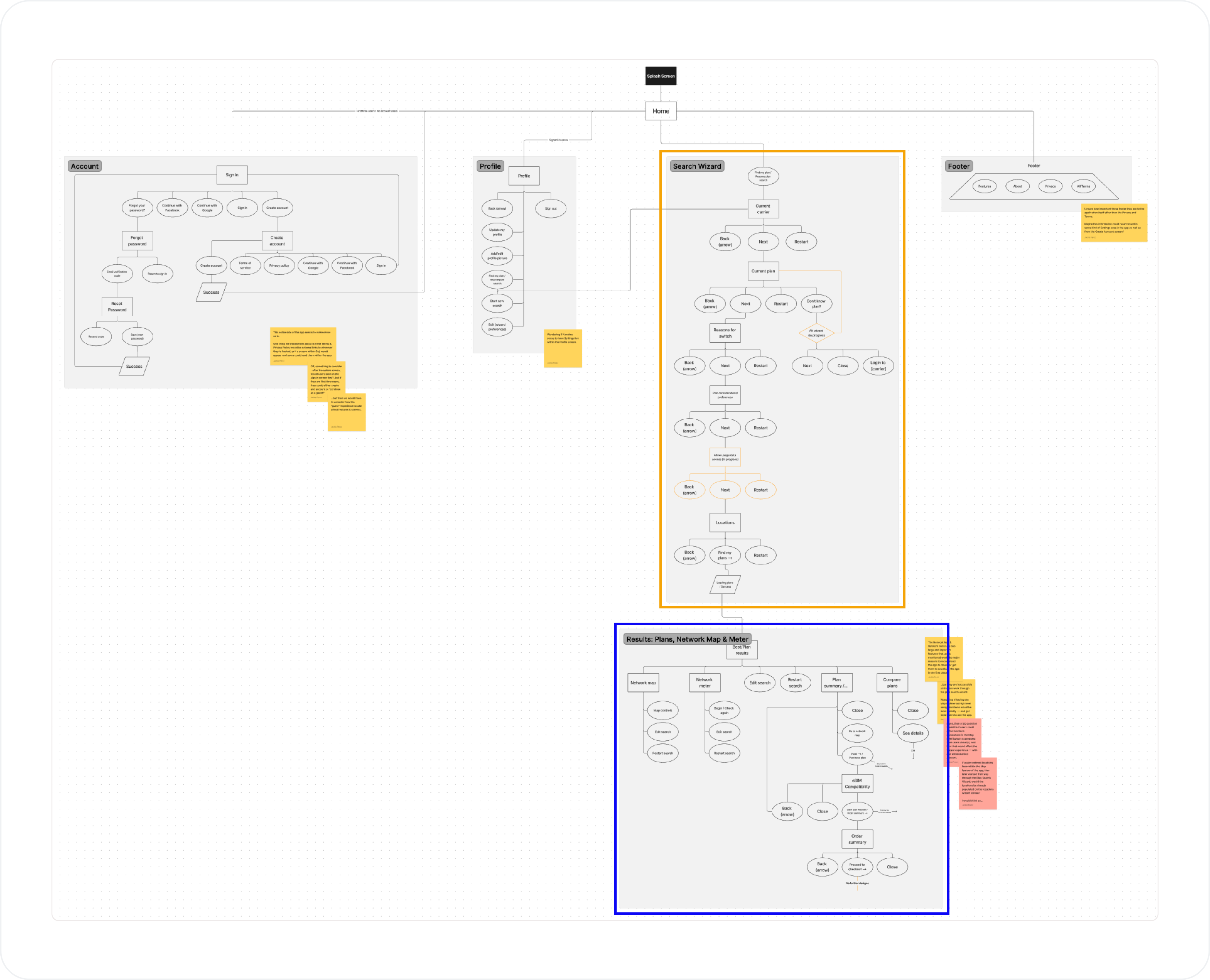
⬑ Architecture Pain Point: Originally, users had to work throught the Plan Search Wizard (orange box) in order to access features our participants considered most important (blue box).
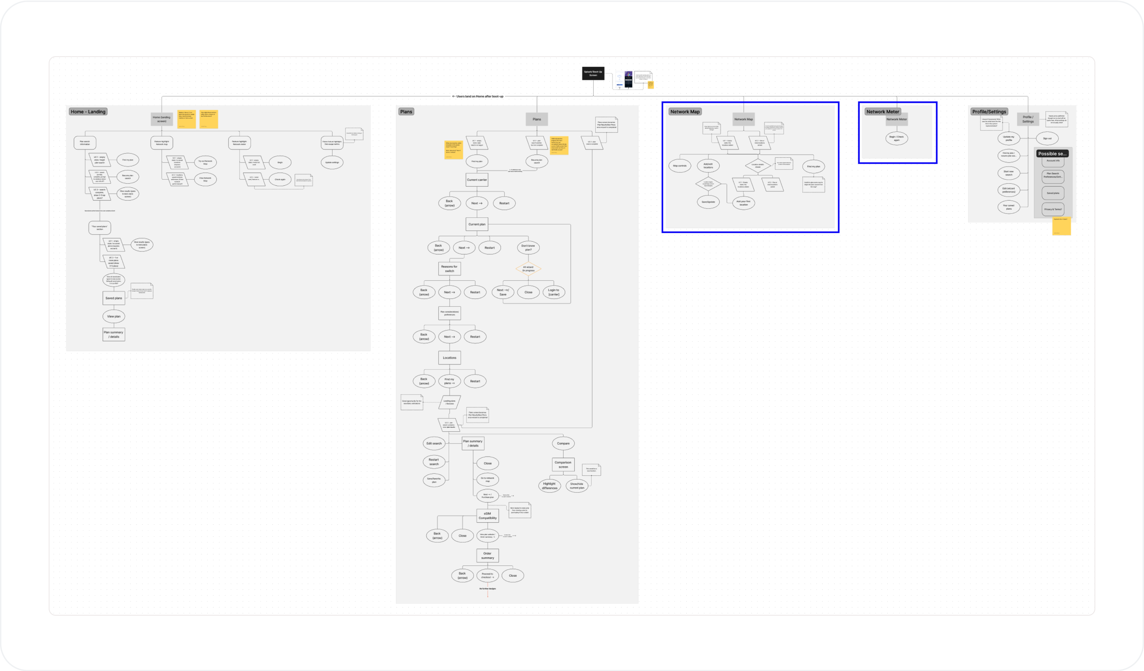
⬑ Architecture Solution: By making the Wizard an optional feature and bringing the Network Map and Meter forward in the main navigation, users are free to use them immediately to gain information on their current plan and build some trust with the app before shopping for a new one.
Features and screens
Using the feedback collected from our testing participants as well as the new architecture, I focused on making updates and enhancements to screens and flows that were causing the largest pain points. Some key examples below:
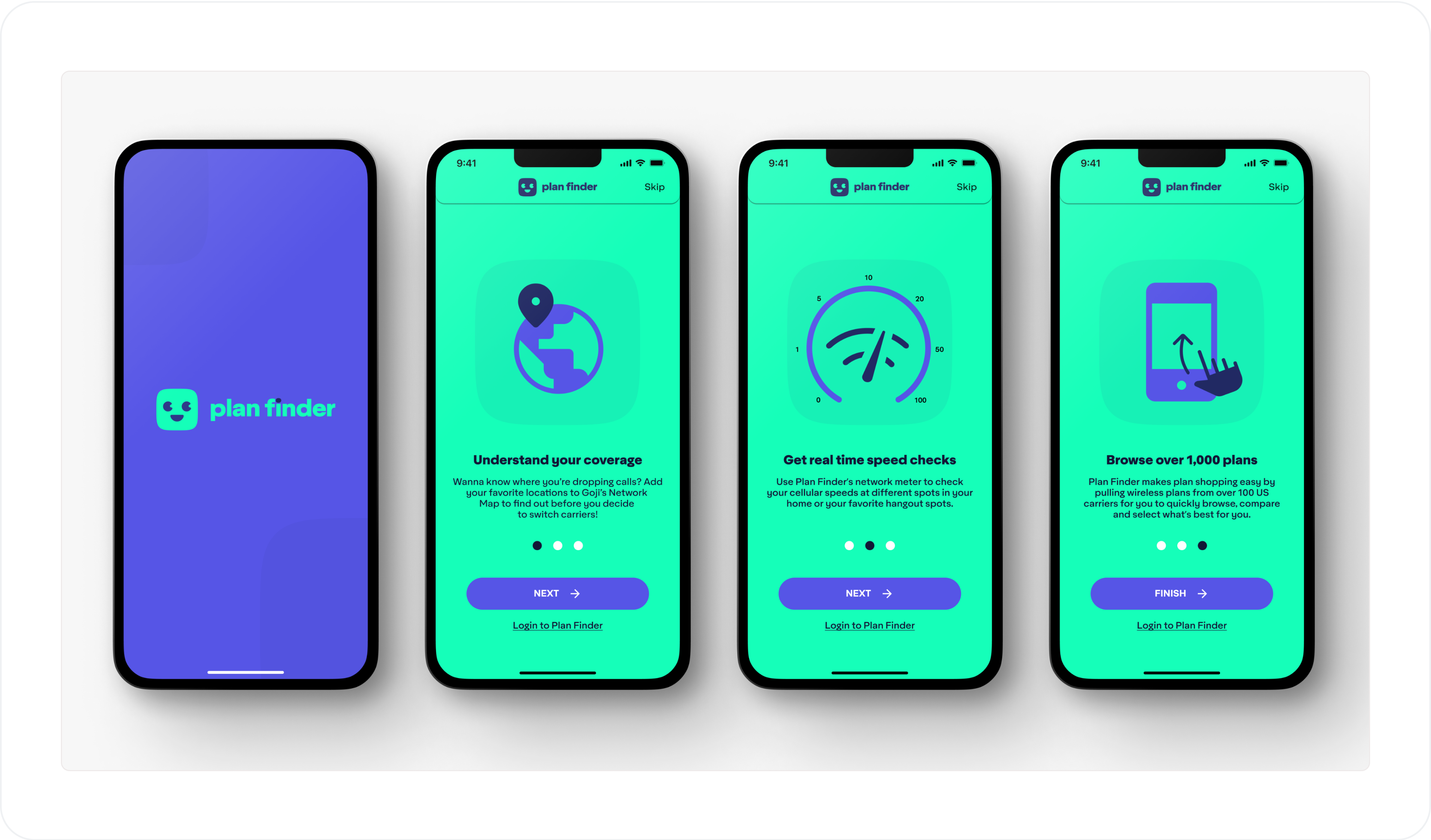
⬑ Onboarding: First-time users or users without an account will now be onboarded to the app's main features.
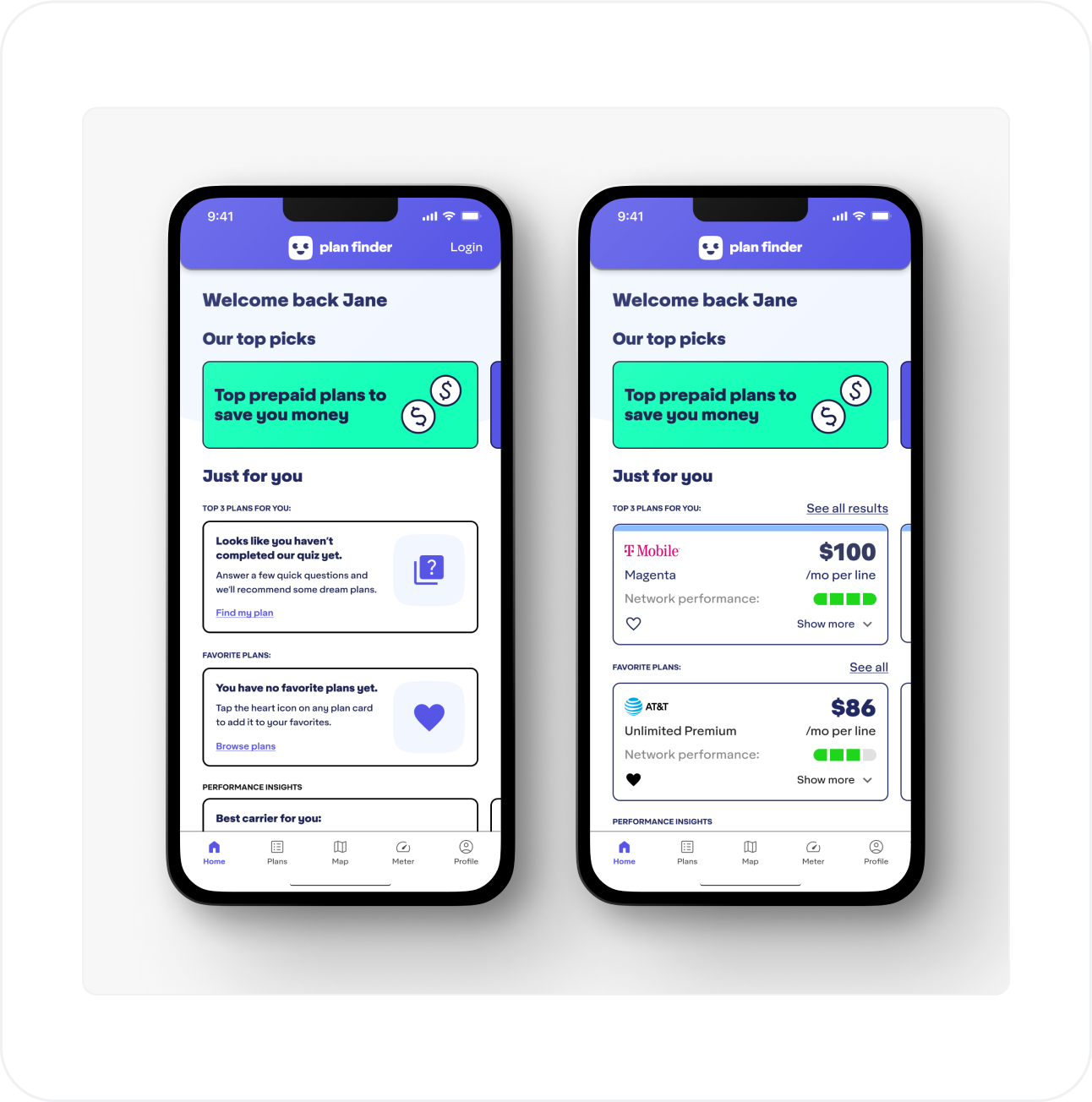
⬑ Home: A more personalized home experience has replaced what was considered to be a redundant landing screen.
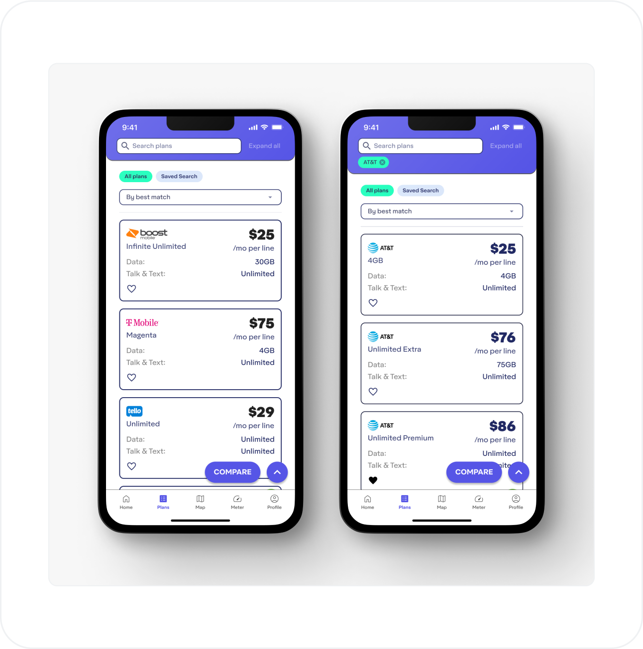
⬑ Plans: Users can now jump straight into browsing plans without having to work through the Plan Search Wizard, as well as type in custom criteria to narrow down their search.
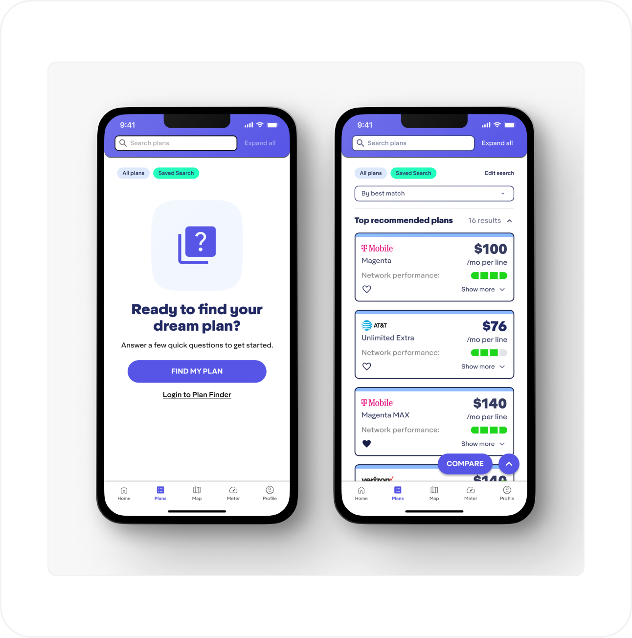
⬑ Plans - Saved Search: A new saved search tab on the Plans screen allows users to access the Search Wizard questionnaire while keeping the Network Map and Meter open to use in the main navigation.
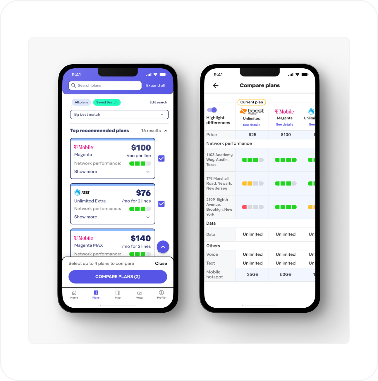
⬑ Plans Comparison: If users have completed the Search Wizard (questionnaire) and told the app what their current plan is, it will be included in the comparison table by default.
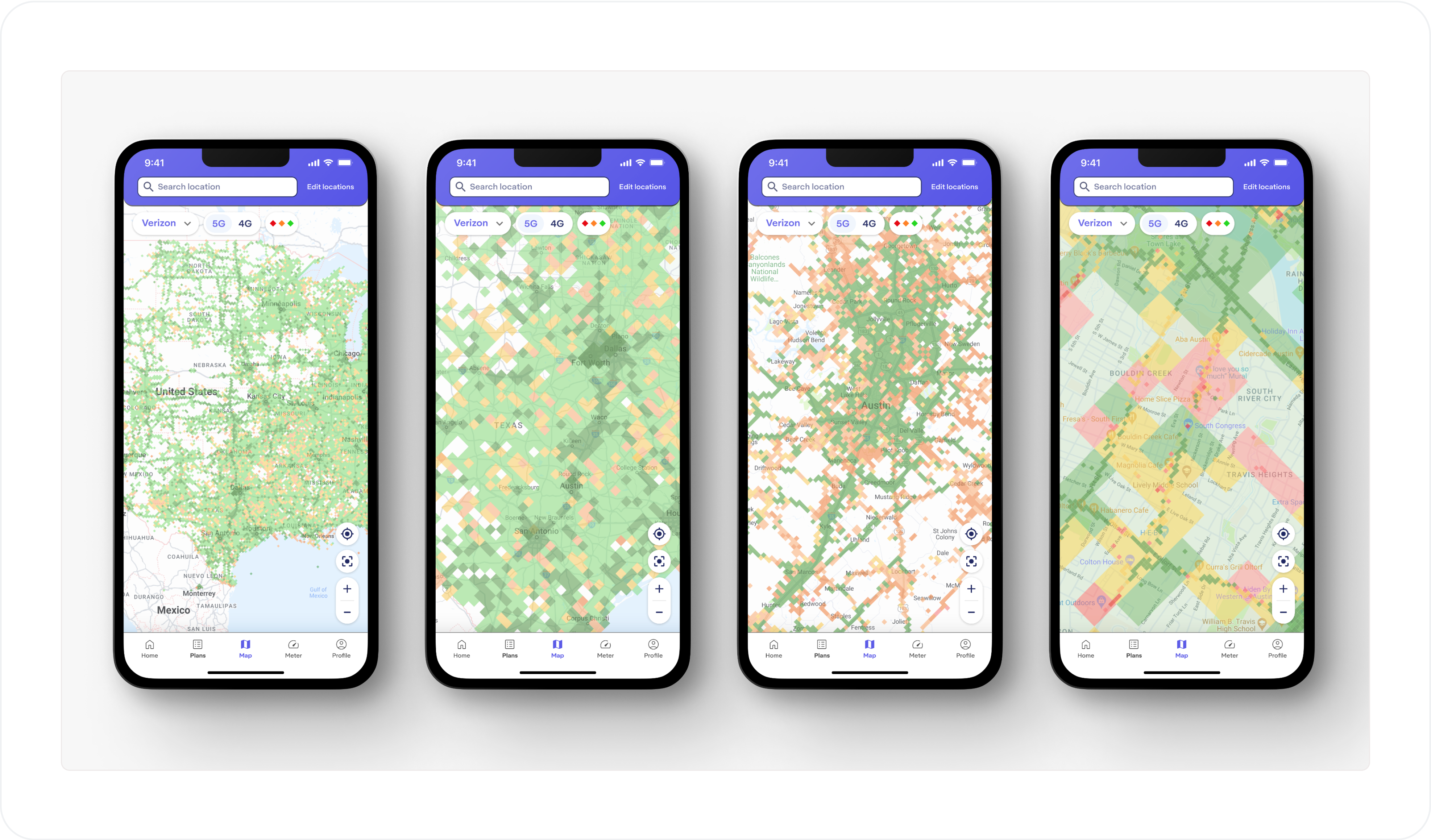
⬑ Network Map Data: Working with stakeholders and developers, more data bin sizes have been defined for visualization across more zoom levels on the map.
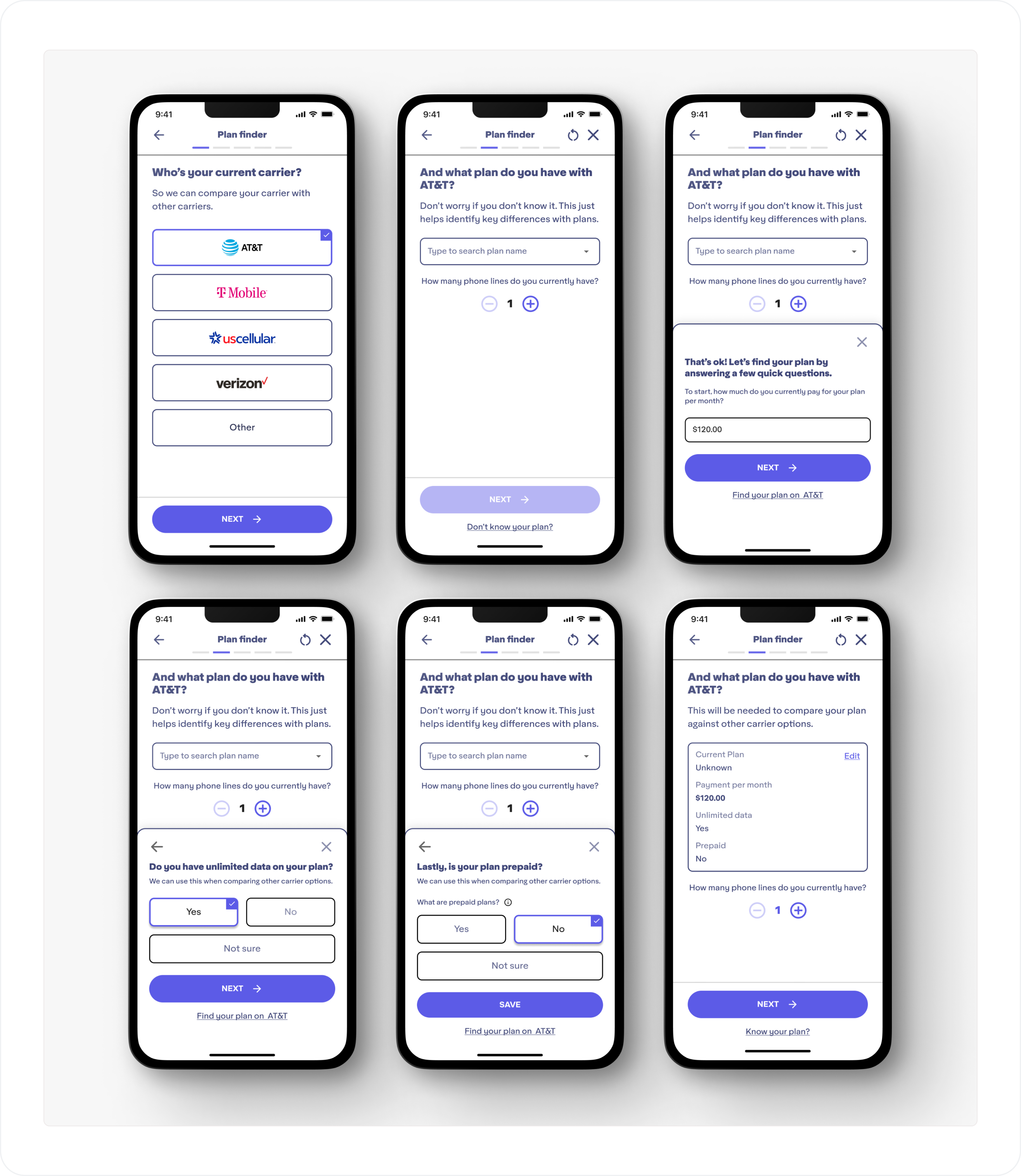
⬑ Alternative Current Plan Questions: In the Search Wizard questionnaire, if a user doesn't know what exact plan they have, they can now answer some alternative questions that the app can still use when making plan recommendtaions.
03 | Modifying for desktop
While designs were wrapping up for mobile, I also designed the screens to be responsive for a desktop version of the application. Everything except the Network Meter feature is functional for use in a browser.
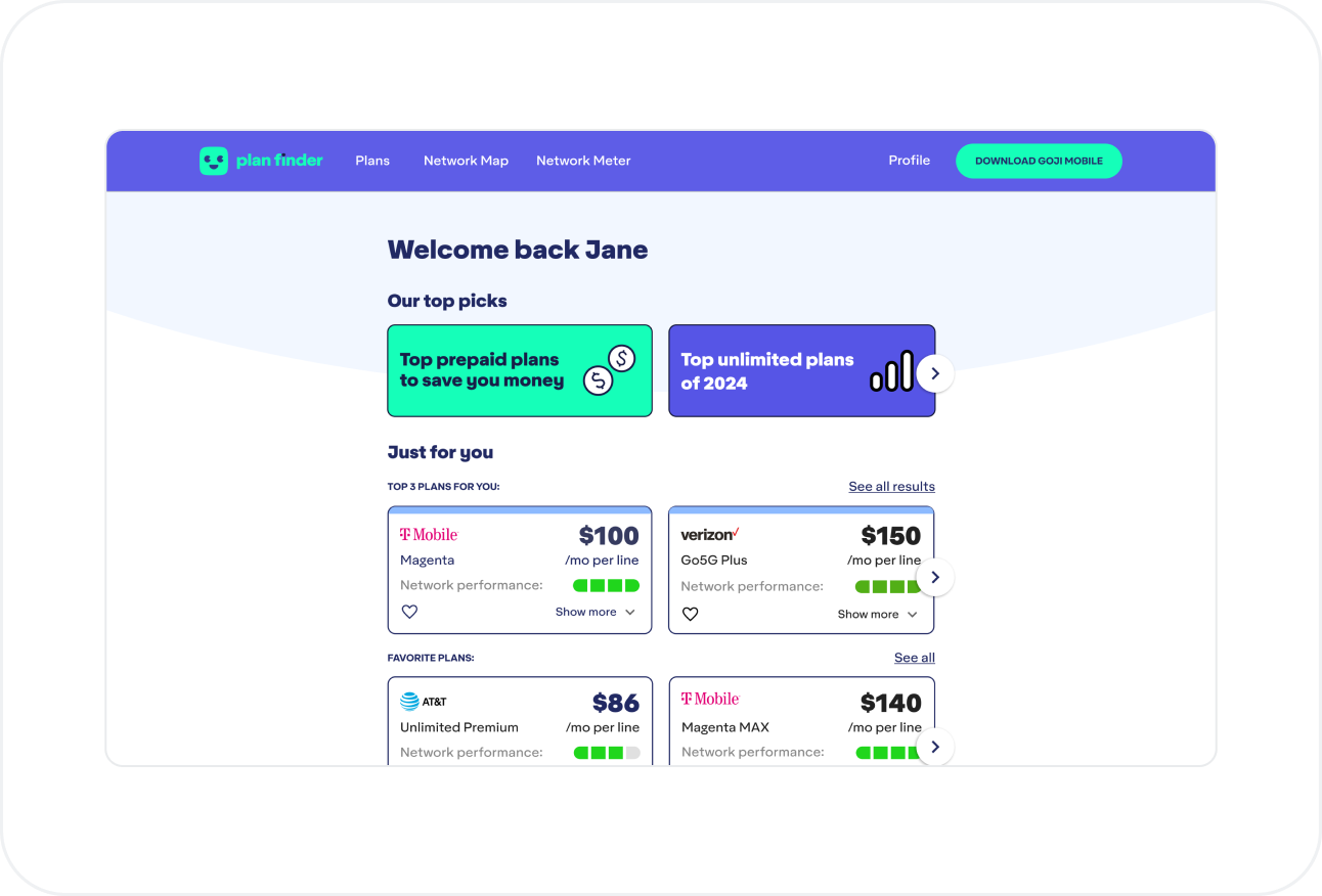
⬑ Home: Users can still have a personalized experience on the desktop home screen.
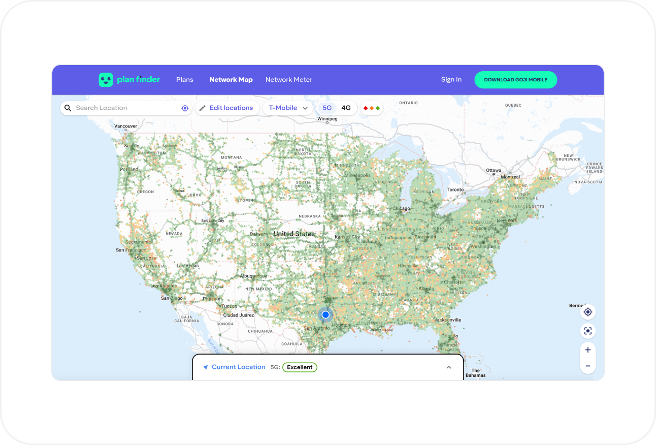
⬑ Network Map: More screen space allows users to take in more data at a glance.
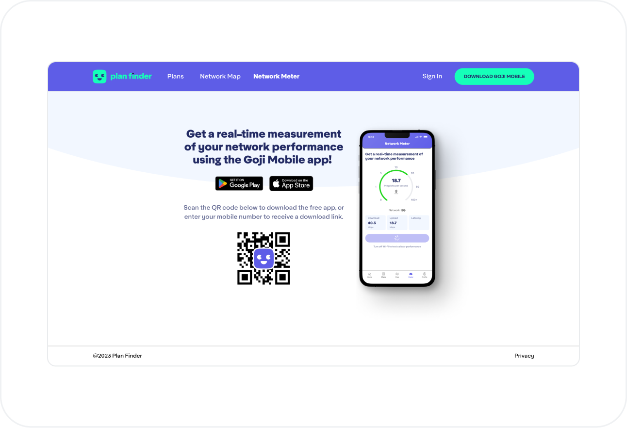
⬑ Network Meter: On desktop, this screen pushes users to download the mobile app.
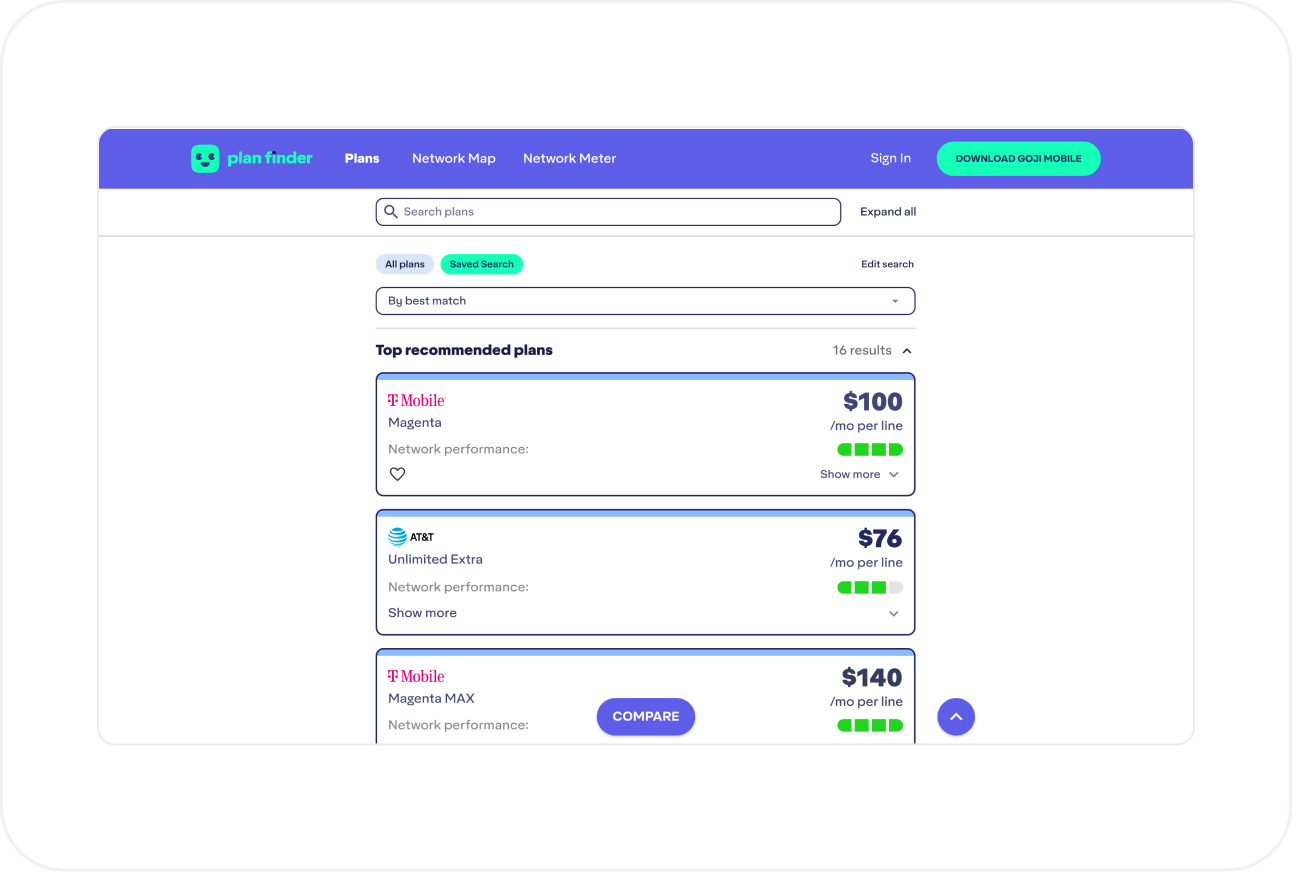
⬑ Plans: Users can still browse and compare countless plans like they would in the mobile app.
Outcomes
- Research and designs delivered over the course of 5 months
- High-fidelity Figma prototypes, designs, and components for implenting the application ot the Apple and Google Play stores
- High-fidelity Figma prototypes, designs, and components for implementing for desktop
- User story definitions for developers
- Application successfully submitted to stores
- Roadmaps and ideas for additional improvements and future sprints
