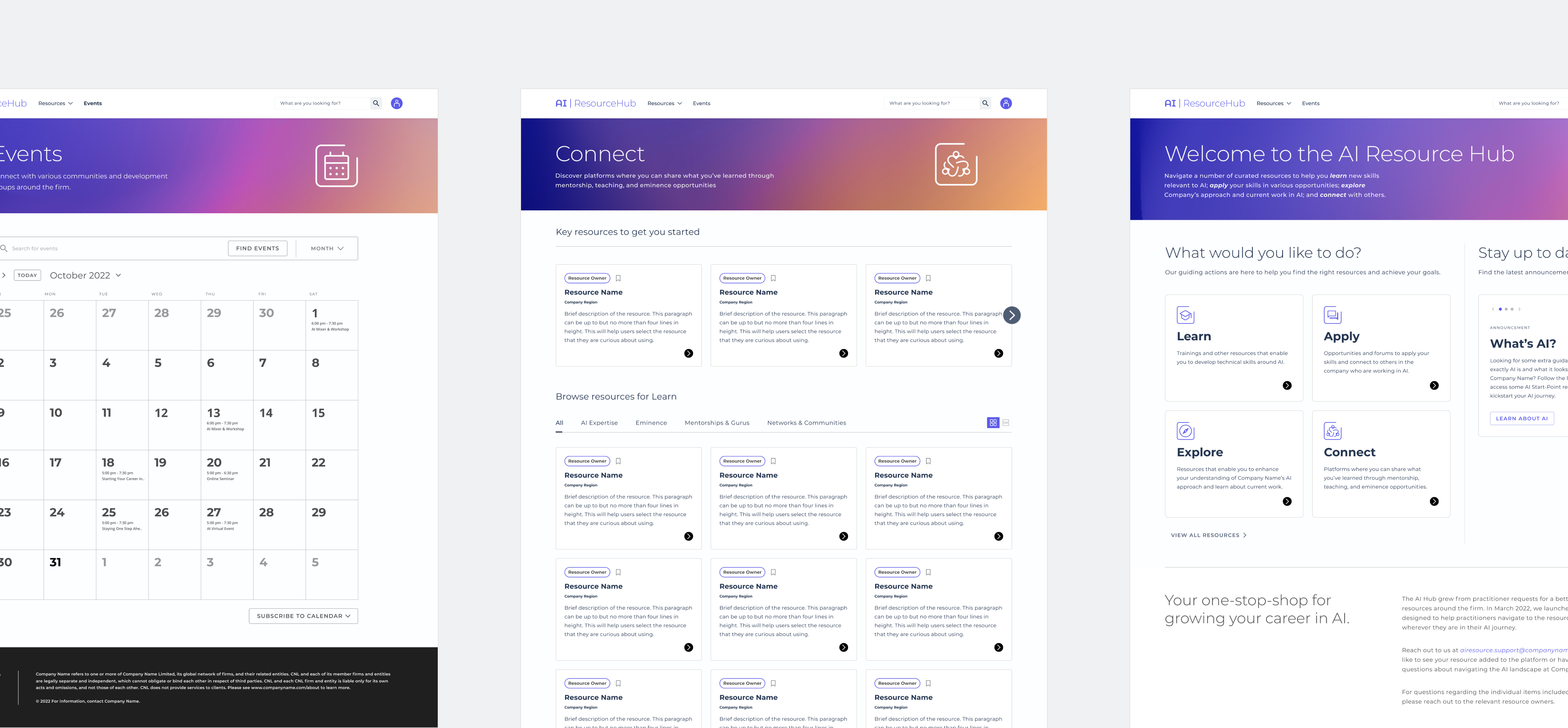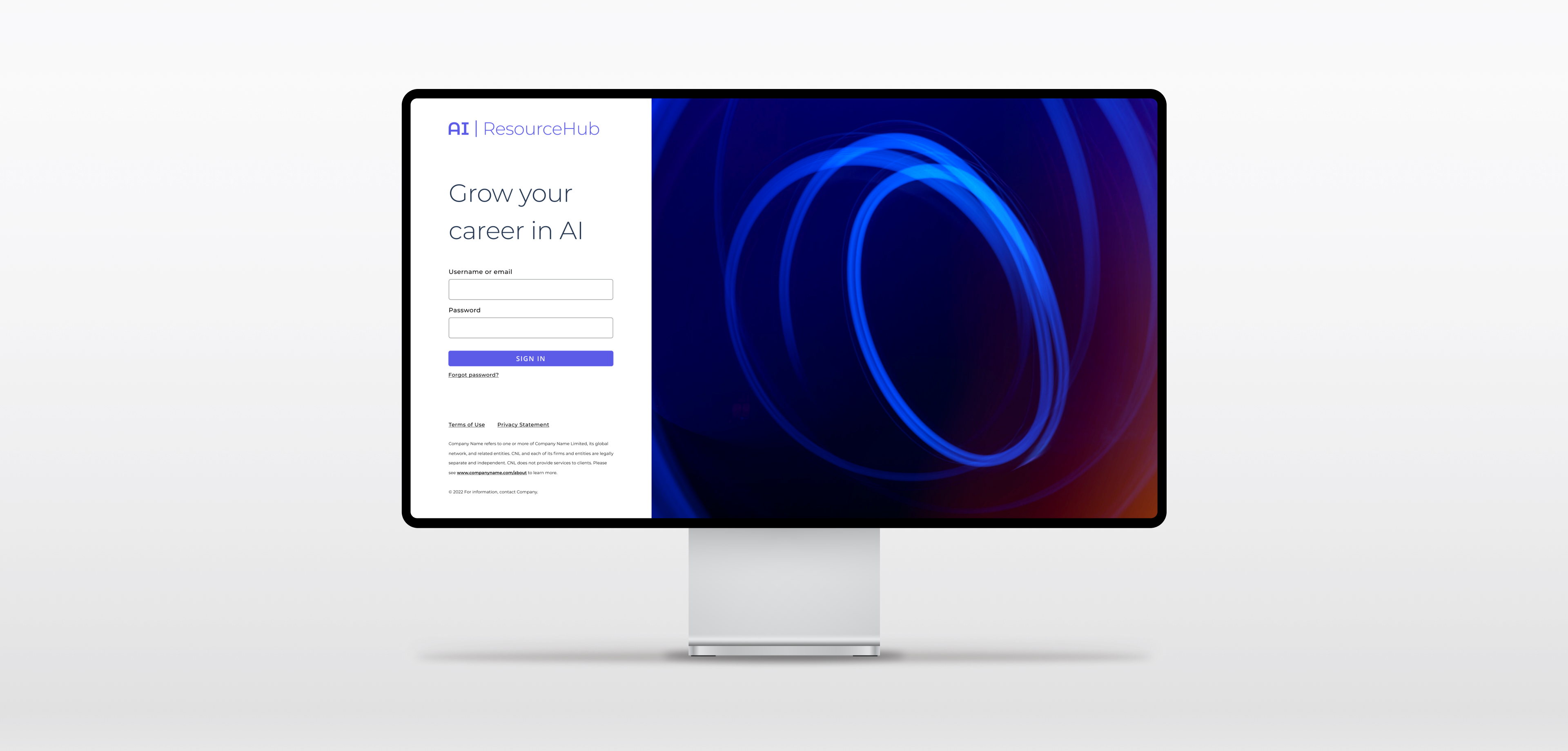
AI Resource Hub is an internal digital platform that connects AI practitioners with curated resources to further develop and apply their skills.
CONTRIBUTION
User Experience
UI Design
User Testing Moderation
YEAR
2022
About the project
Disclaimer
Because of non-disclosure agreements, I cannot go into full detail of everything delivered and developed for this project online. I would be happy to chat more in person if you contact me.
The AI Resource Hub was designed and developed for a global professional services company to help their AI practitioners navigate the various career growth materials available through the company. Prior to implementation, a central place to discover and access relevant resources did not exist. Practitioners would have to seek out leadership for guidance without necessarily being fully aware of what was available to them.
The vision was to create a curated “one-stop-shop” that would make all the resources easily accessible while fitting within the company’s ecosystem of websites. The AI Resource Hub would exist as a WordPress microsite, with resources grouped according to four “guiding pillars” to help users navigate through the various materials. Because all the resources are hosted outside the site, the Resource Hub acts as a launchpad that redirects users to the corresponding URLs.
My responsibilities were comprised of three main challenges:
01 | Increase content visibility and guidance
An initial version had already been released, and stakeholders had taken the time to conduct informal testing internally with various users, and were able to identify areas of improvement for a second version.
02 | Investigate possibilities for an events calendar
Users who tested the initial version expressed strong interest in having a place to find and sign up for internal AI-related events and meetups so they could better plan ahead.
03 | Conduct user testing for enhanced designs and features
I conducted seven one-on-one user testing interviews over Zoom to gauge usability and usefulness of current and potential new features.
01 | Increasing visibility and guidance
An initial version of the Resource Hub had been launched several months before, and through informal testing stakeholders were able to identify major pain points and improvement opportunities from the feedback. The information architecture centered around what we called the “guiding pillars” (Learn, Apply, Explore, and Connect), and each pillar contained resources split into sub-categories. We learned that users found the pillars to be quite helpful, but first-time users and more entry-level practitioners wanted a bit more guidance on where to start. On the other hand, returning users didn’t always remember where they left off.
My approach was to rethink the main navigation and provide visibility into what the pillars contained and introduce a "get started" section on each pillar page. I also introduced a pattern to save/bookmark resources for returning users. The solutions were honed over the course of several weeks of iterating, prototyping, and demoing on weekly team calls.

⬑ Architecture: The information architecture itself was understandable to users, the challenge was how might we better guide them to the right resources?
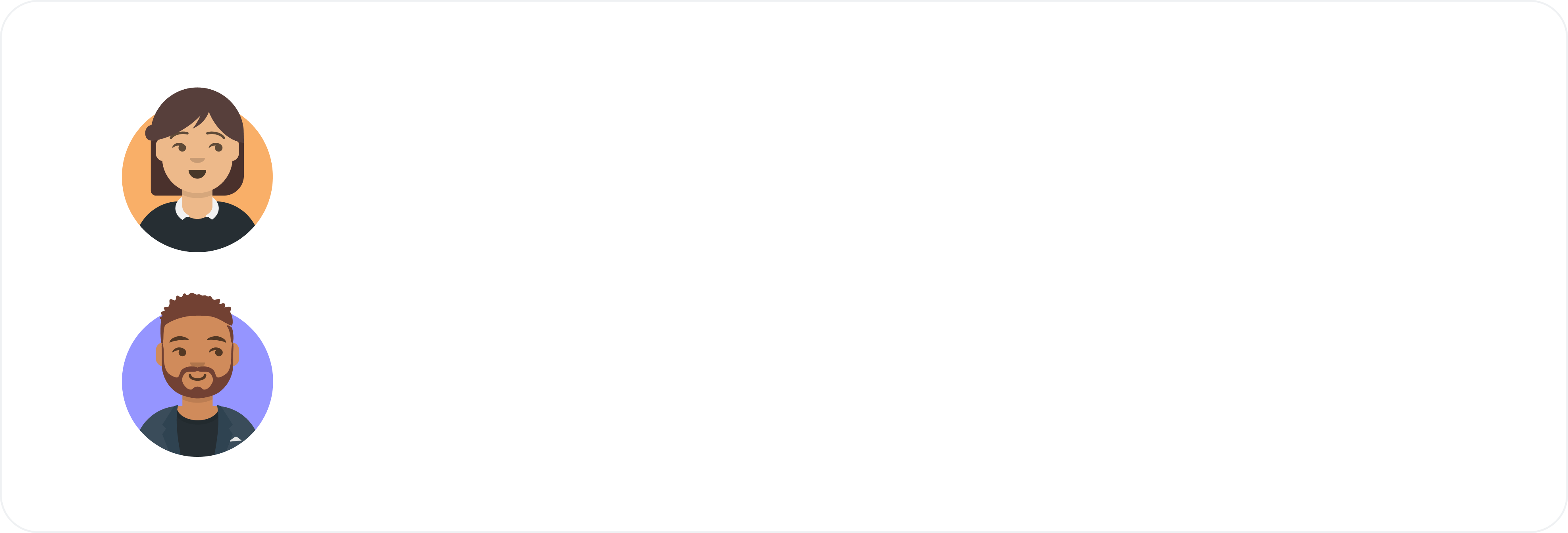
⬑ Personas: Though there are many types and levels of AI Practitioners, these were the key users that informed design enhancements.
Solutions
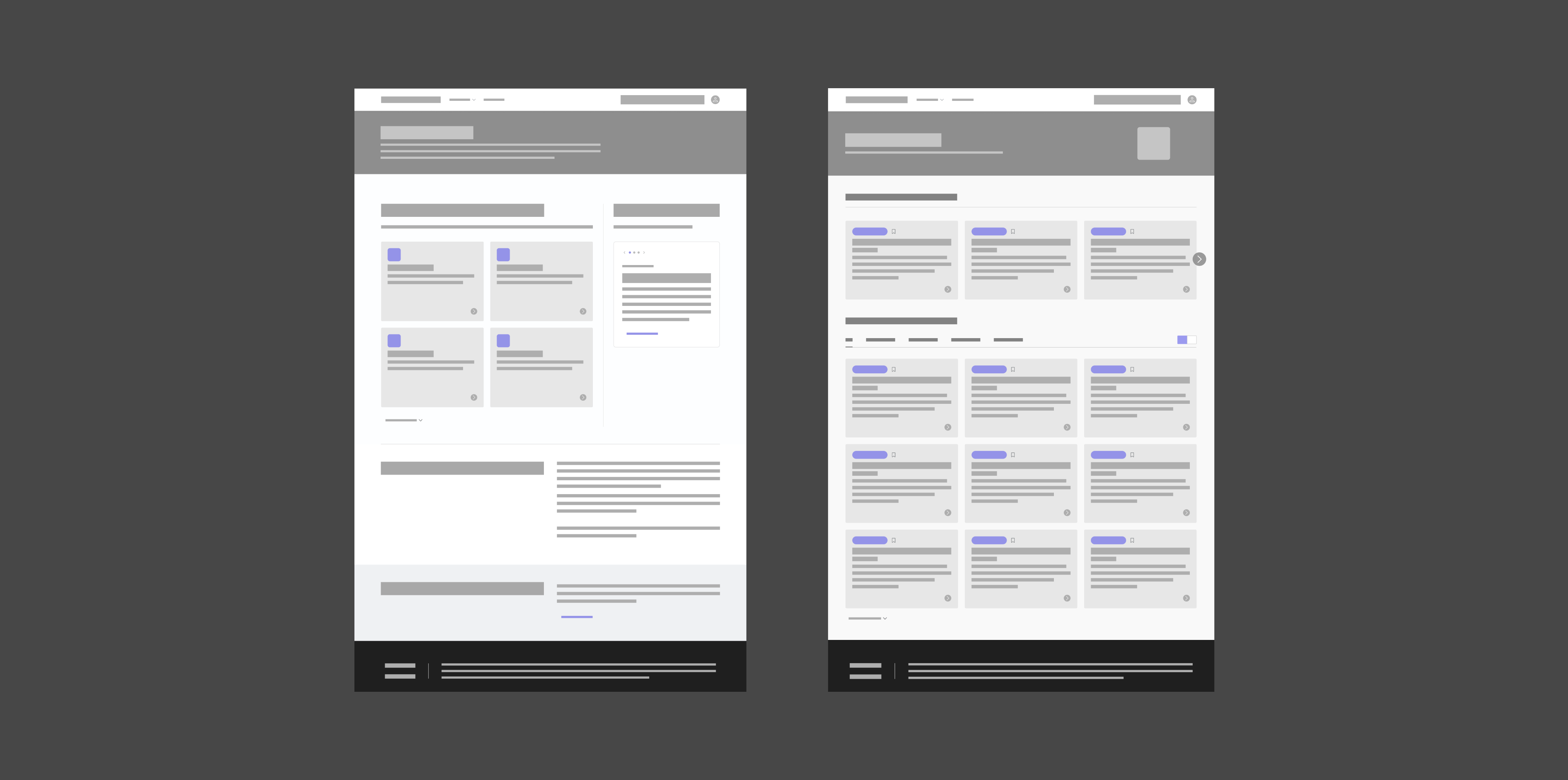
The home and pillar screens were the main areas of focus for satisfying the key needs of our users. Overall, a new resources menu in the main navigation was introduced, as well as a small announcements section on the home screen. This would allow the content management team the ability to assist both entry-level practitioners get started and returning users stay up to date on new resources or opportunities.
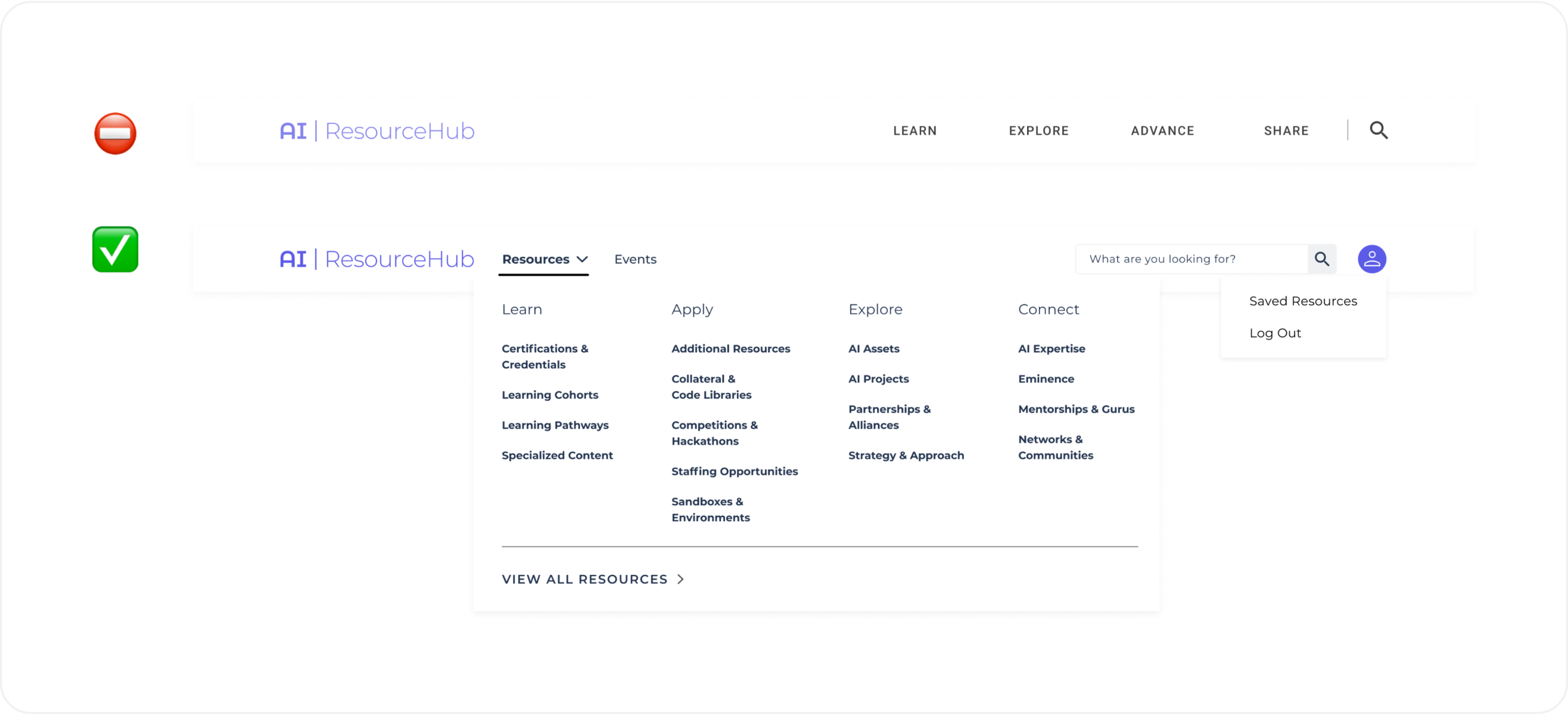
⬑ Main Navigation: Users can now view a resource menu organized by Pillar and showcasing the sub-categories within them. The new UI also allowed space for an Events page, and better emphasizes the search functionality as well as the user’s account menu.
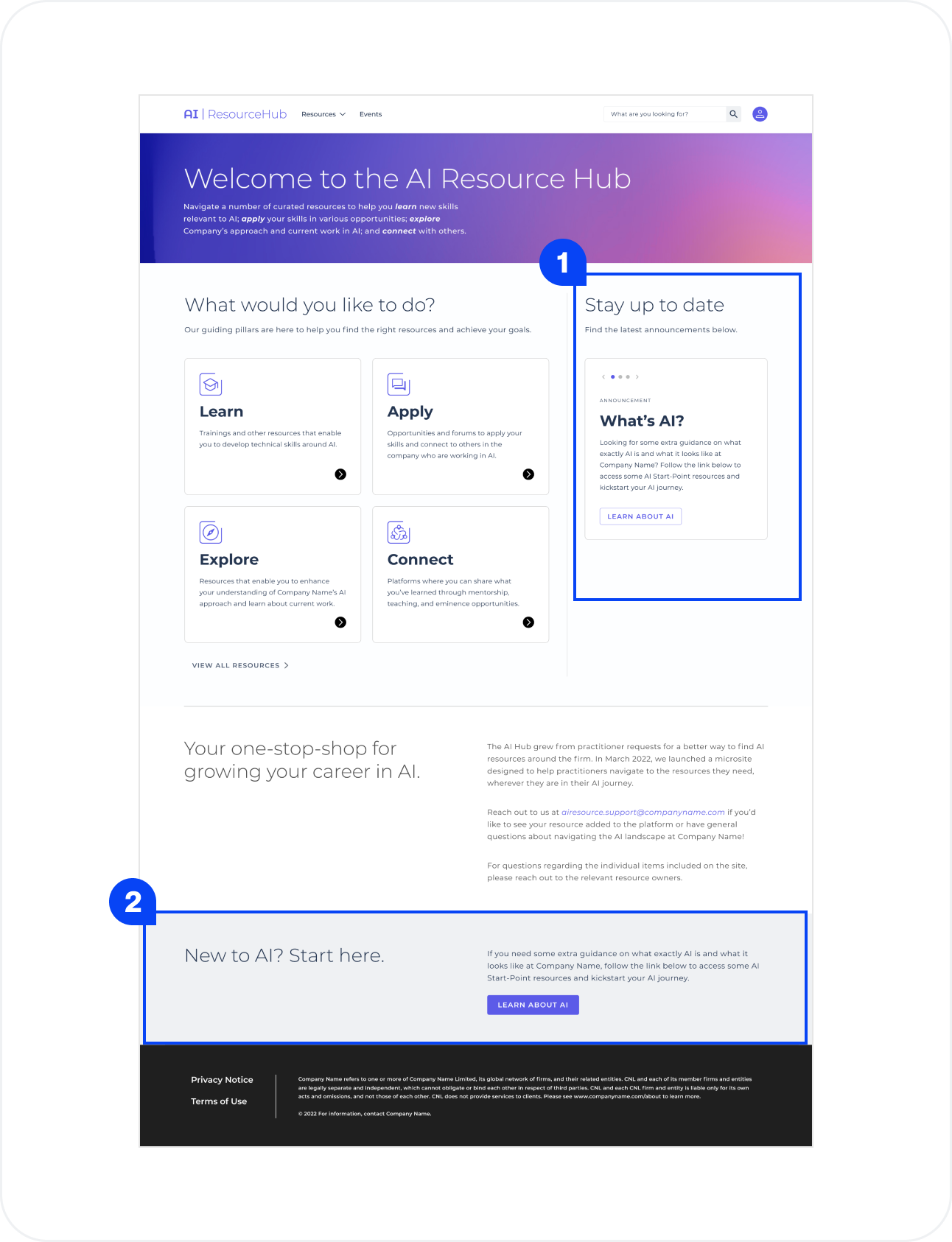
⬑ Home:
- Announcements carousel that can be easily managed and published by the site management team.
- A permanent section for entry-level practitioners to use.
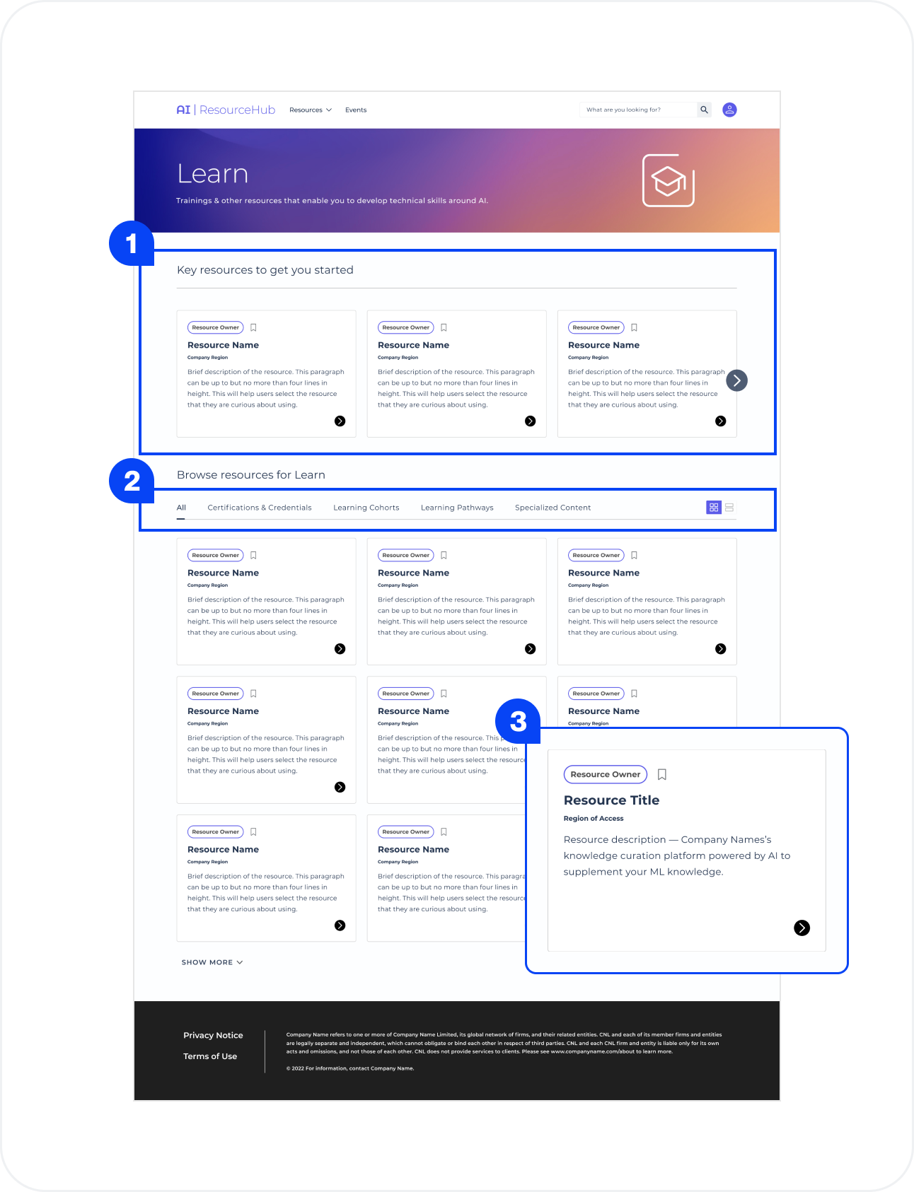
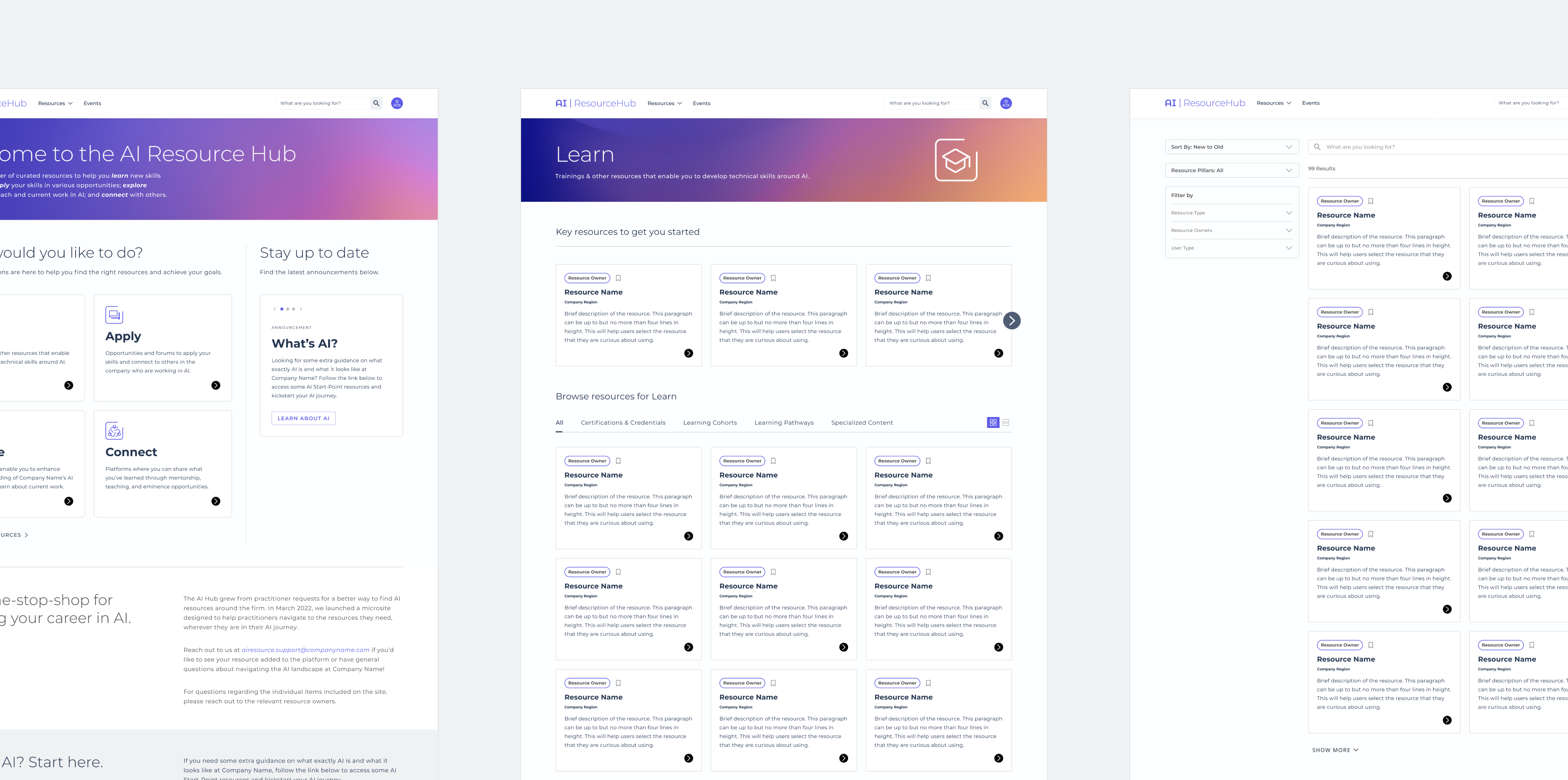
⬑ Pillar Template - Learn:
- Carousel of 3–5 resources curated by practitioner leadership to act as a starting point.
- Tabs: instead of simply listing the resources by sub-category in one long scroll like in the initial version, users can now simply browse by tab.
- Users can save or bookmark resource by clicking the icon on the cards.
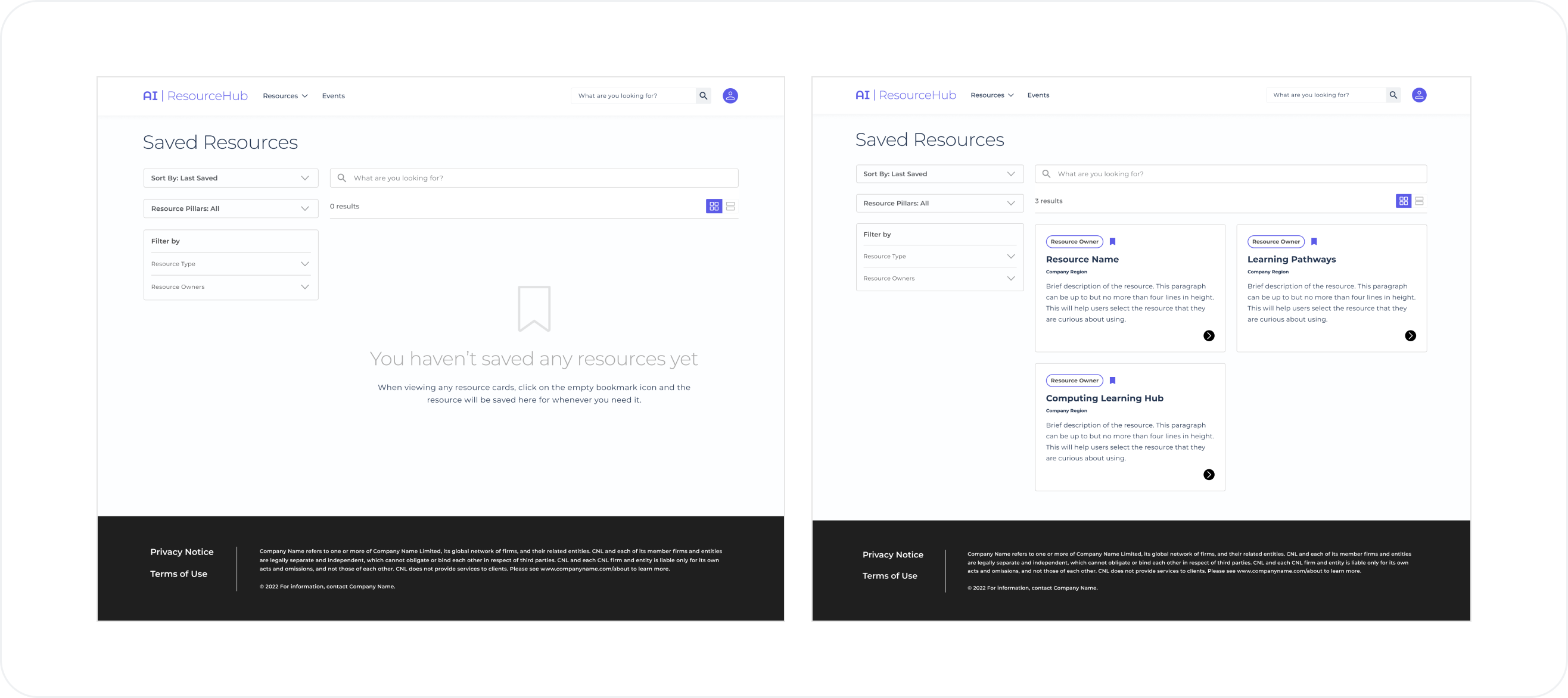
⬑ Saved Resources: Users can access their saved resources from the account menu. The screen mimics the general search UI, but instead only has saved resources.
02 | Investigating events
I was tasked with looking into a feasible WordPress plugin that could be used to introduce a new events calendar feature and UI to the site. The plugin was required to be within budget and be compatible with Outlook.
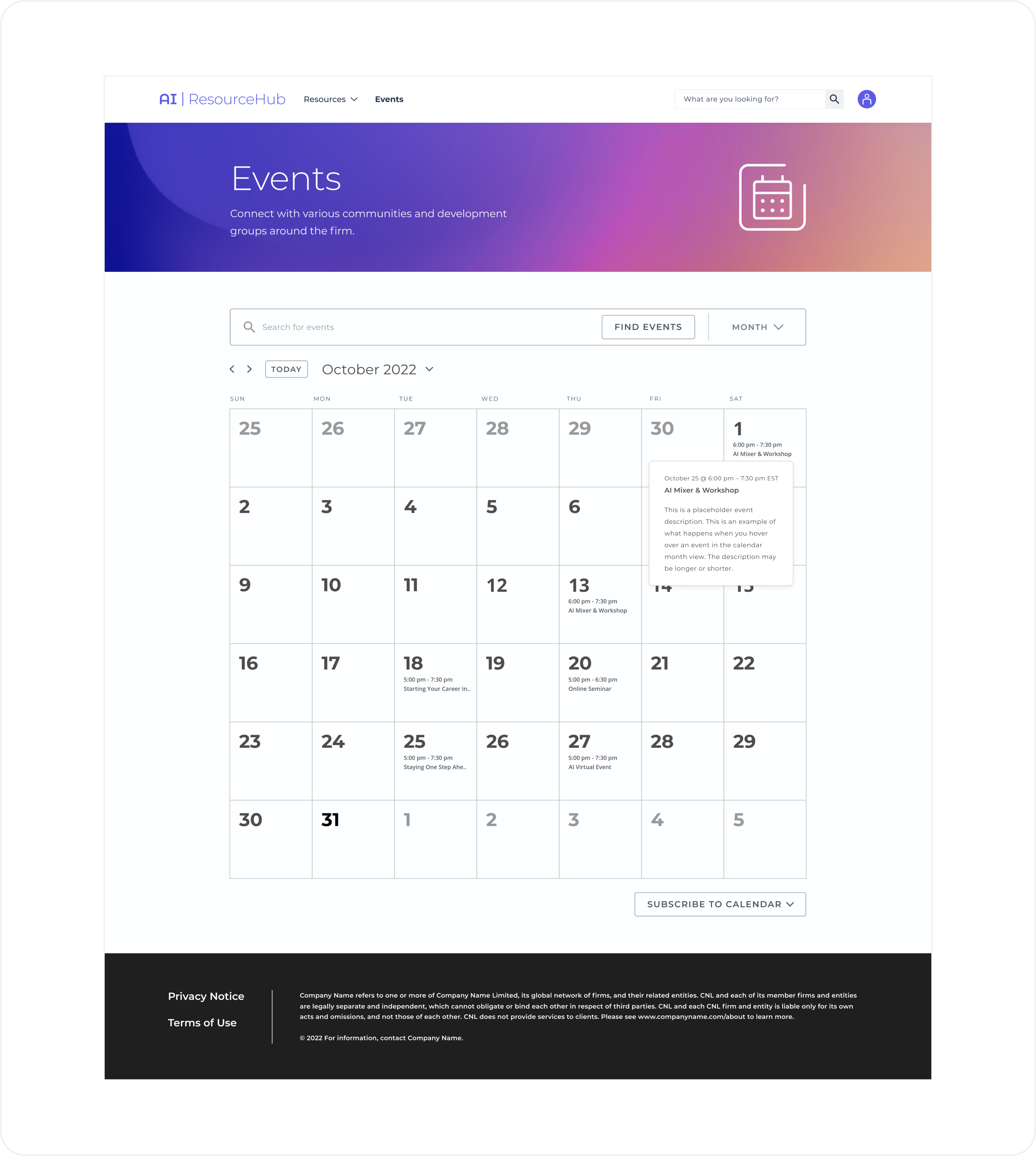
After narrowing it down to three potential plugins, I recommended we move forward with The Events Calendar, which was within budget; compatible with Outlook; and was scalable depending on how many events stakeholders needed to import. Users would be able to add individual events to their own calendar; subscribe to the entire calendar; as well as search and filter events.
It was deemed the best and most flexible option, so we moved forward with its built-in calendar widget. An example of the Month view shown below.
03 | Testing with users
I was able to organize and moderate seven 60 minute feedback interviews with participants over the course of two weeks. The goal was to gauge usefulness and usability of current and new features, as well as identify any additional blind spots in user behavior until analytics could be implemented by the stakeholder development team.
I provided the interview scripts, notes, and recordings to stakeholders as deliverables after all the interviews were complete. I also delivered a findings summary deck in the form of a shareable PDF so that planning for the current and future sprints could begin.

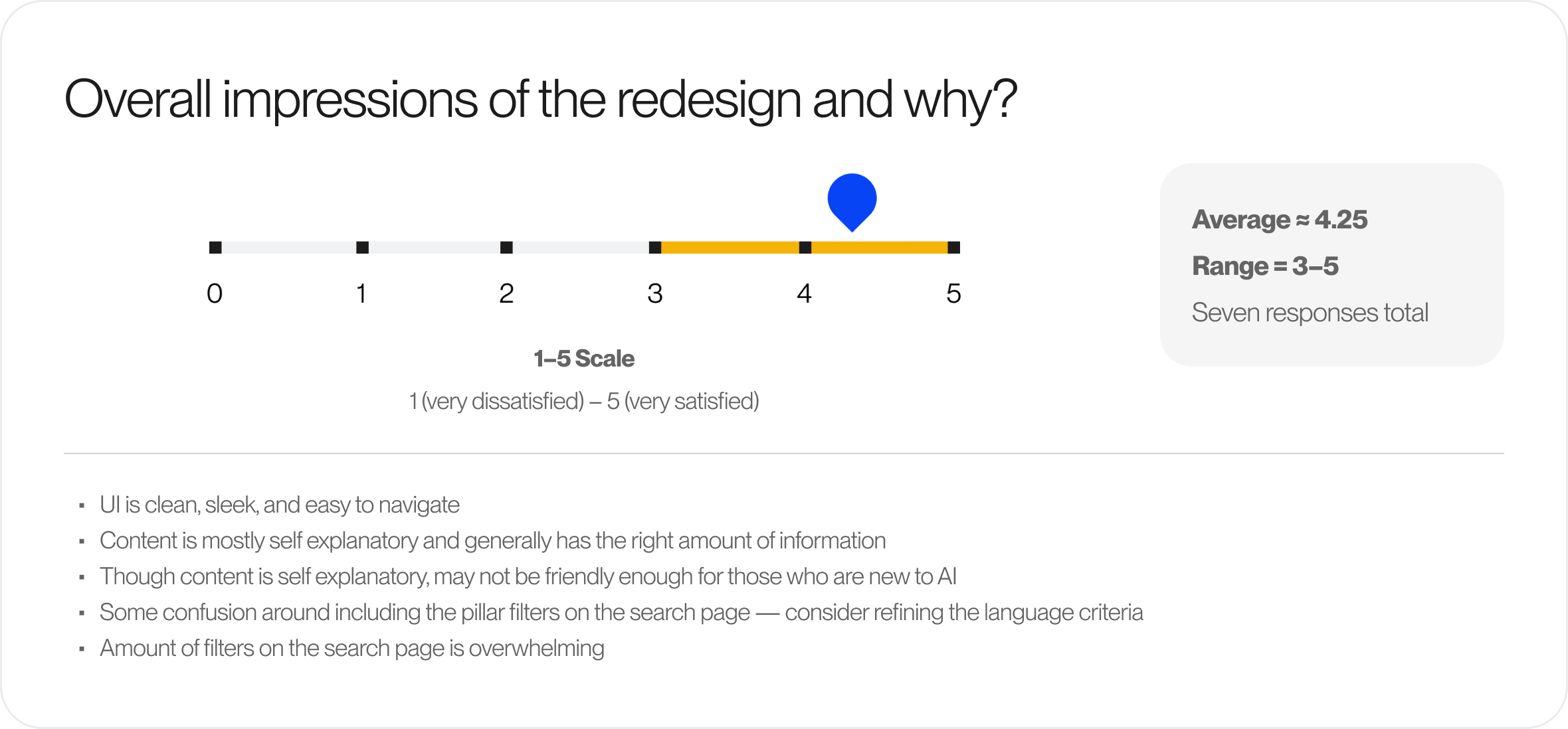
After evaluating the feedback data we collected, minor changes were made to the copy throughout the site, and we determined which search filters we could do away with. Any larger enhancements were saved for a future phase of the platform.
Outcomes
- Research & designs delivered over the course of 8 weeks
- High-fidelity Figma prototypes, designs, and components delivered for implementation
- Refactored UIs that utilitze user-friendly navigation patterns
- Roadmaps for future enhancements
